
2. Setup
2.1 The plugin
First of all, the plugin "Responsive Tables" must be enabled:
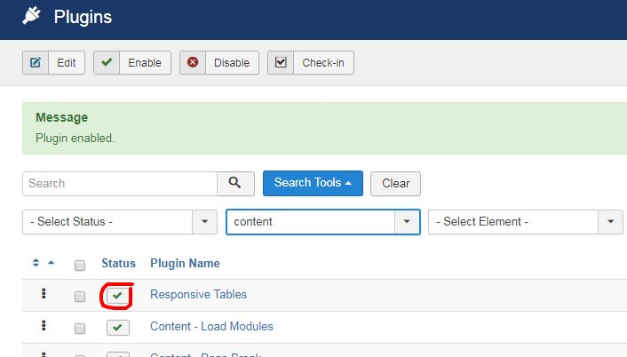
If the plugin is not enabled, your HTML tables won't be responsive !
2.2 The HTML table
Let's create our first responsive HTML table.
Open an article.
To insert your HTML table, you must access to the source code option in the text-editor.
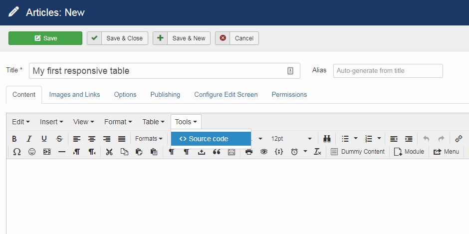
Now in the popup, write your HTML code.
Here, you must add the CSS class responsive rt to the table tag to get the responsive effect on your HTML table.
<table class="responsive rt">
  <thead>
    <tr>
      <th scope="col">#</th>
      <th scope="col">First</th>
      <th scope="col">Last</th>
      <th scope="col">Domainl</th>
    </tr>
  </thead>
  <tbody>
    <tr>
      <th scope="row">1</th>
      <td>Mark</td>
      <td>Otto</td>
      <td>@osm</td>
    </tr>
    <tr>
      <th scope="row">2</th>
      <td>Jacob</td>
      <td>Thornton</td>
      <td>@joomla</td>
    </tr>
    <tr>
      <th scope="row">3</th>
      <td>Larry</td>
      <td>the Bird</td>
      <td>@nba</td>
    </tr>
  </tbody>
</table>
Example of HTML table code
Now, your responsive HTML table is ready to be displayed.
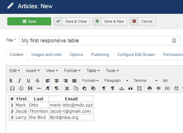
Other option
You can also use the table button of your text editor and add your HTML table with it. To add the CSS class responsive rt to the table tag, you must toggle your text-editor by clicking the buttom below the text-editor.
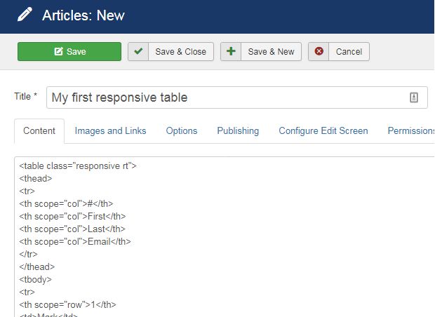
You don't need to indicate a
width and/or a height to your HTML table. Otherwise, it will probably break the responsive effect.Click on "Save" once you're done.